-
-
-
-
-
-
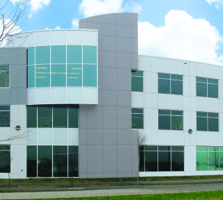
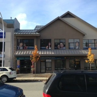
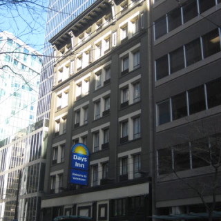
 Business Park
Adding the black mullions and the warmer body colour brought life back into this business park.
-
-
-
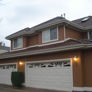 Multi-Family
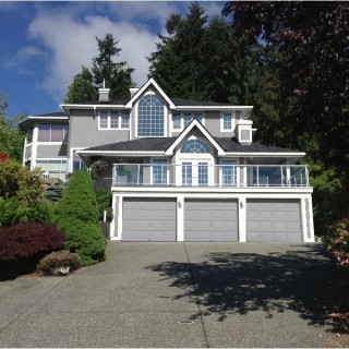
In this project, the owners didn’t want a significant change. Deepening the contrast updates the colour in a conservative manner.
-
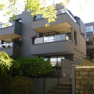
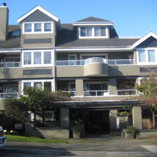 Kitsilano Condo
This Kits condo unit was looking a tad tired. Adding contrast with colour made the look “pop”.
-
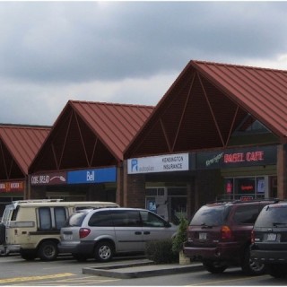
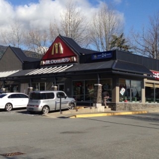 Retail Mall
Updated colour scheme and the texture of the new stone columns adds a modern twist to a dated strip mall.
-
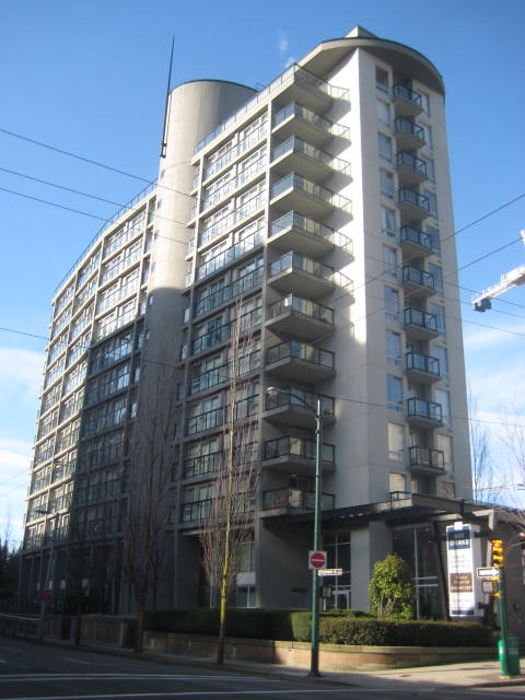
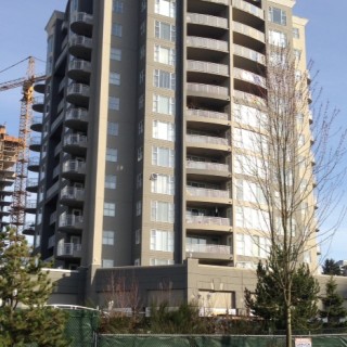 Coquitlam Highrise
With the updated colour scheme, this building looks just as new as the high-rises going up around it.
-
 Commercial Buildings
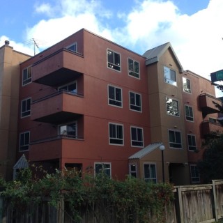
These commercial buildings are very different in architecture but share a common wall that attaches them. Creating a separate colour scheme for each but making sure the colours complimented each other was paramount.
-
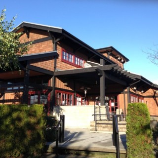 Neighbourhood Pub
With all the new construction going on in the neighbourhood, this pub needed to fit into the landscape.
-
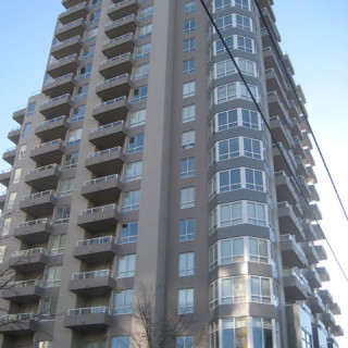 Burnaby Highrise
The main thing that wasn’t going well for this building were the blue windows. We also tweaked the main body colour to a two-tone warm gray.
-
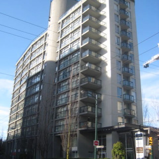 Yaletown High Rise
The red rails and the blue column dated the look. Creamy grays framed by off-black rails put this building seamlessly back into it’s Yaletown demographic.
-
-
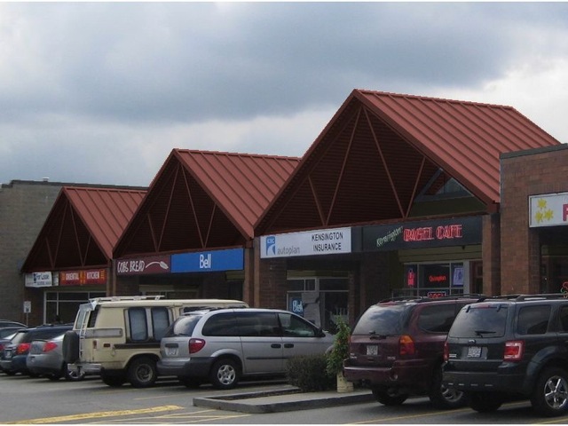
 Neighbourhood Mall
The strip mall instantly receives an update in a colour that flows harmoniously with the brick.
-

View Before and After Images